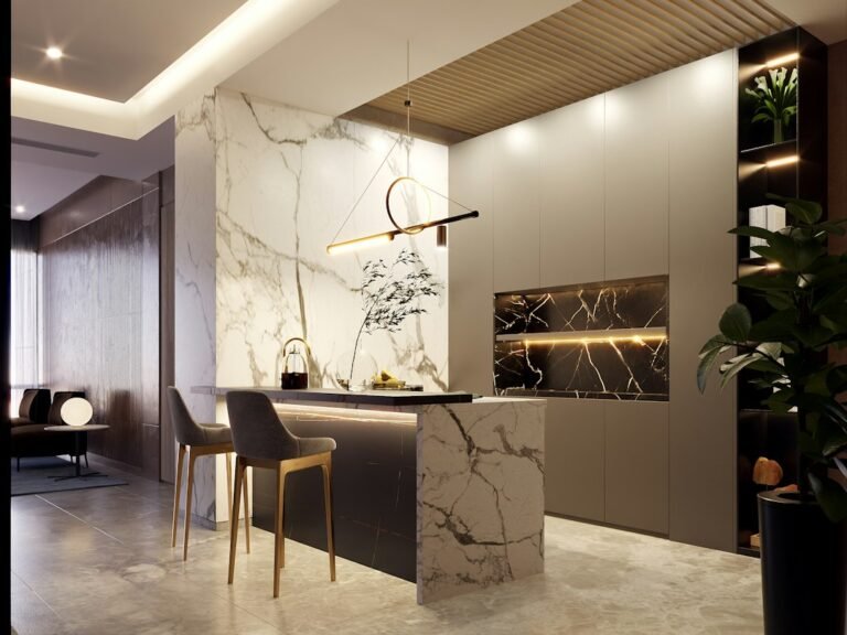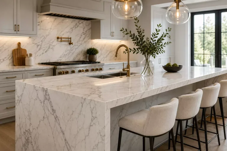
Kitchen Colour Trends: How to Pair Cabinets and Countertops
How to Choose Kitchen Colours That Work with Your Countertops
Choosing kitchen colours is easier when cabinets and countertops are planned together. The goal is not to follow a short-lived trend, but to create a palette that feels balanced, practical and timeless. For homes in Vernon, Kelowna and the North Okanagan, the right combination of cabinetry and surface material can make a kitchen feel brighter, warmer and more cohesive.
Start with the Countertop or the Cabinet Colour?
If you already love a specific slab, use it as the starting point. A countertop usually contains several tones that can guide cabinet, backsplash and hardware choices. If your cabinets are already selected, choose a surface that either creates contrast or quietly connects the palette. Our quartz countertops, granite countertops and porcelain countertops each offer different colour and pattern options.
Warm Neutrals: Cream, Beige, Greige and Natural Wood
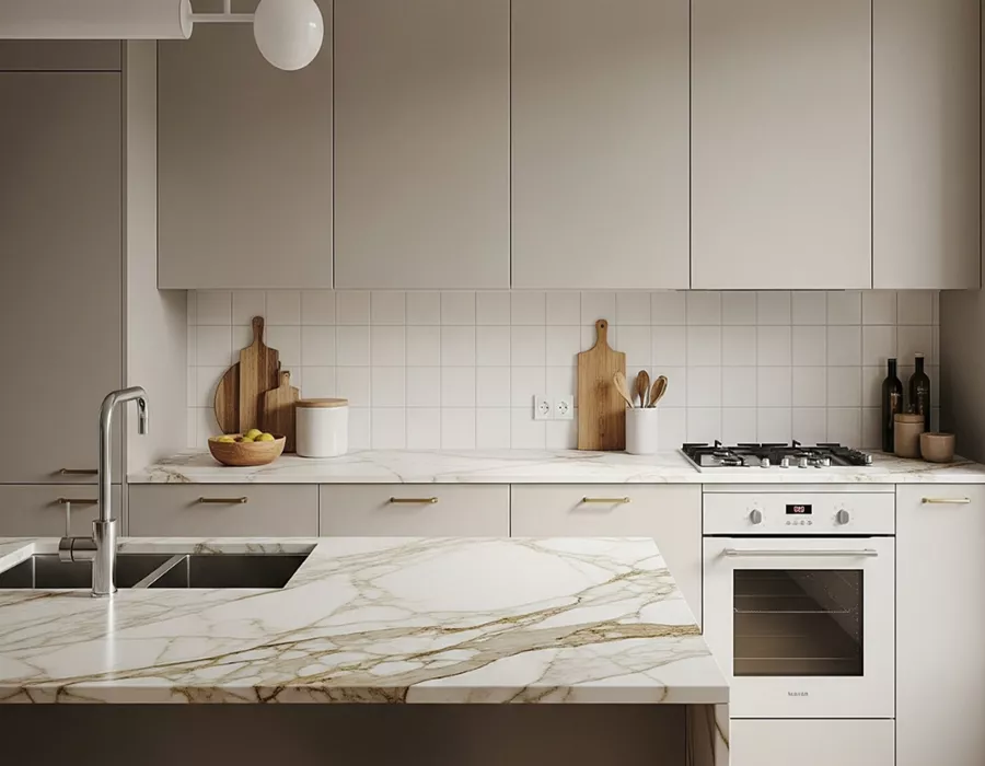
Warm neutrals create a calm foundation that works especially well with natural wood cabinetry and soft off-whites. Pair them with white or cream quartz for a clean look, warm-veined stone for added depth, or subtle porcelain for a modern finish. The key is to match undertones: warm cabinets generally look more intentional beside countertops with cream, gold or soft taupe movement.
Greens, Blues and Deeper Cabinet Colours
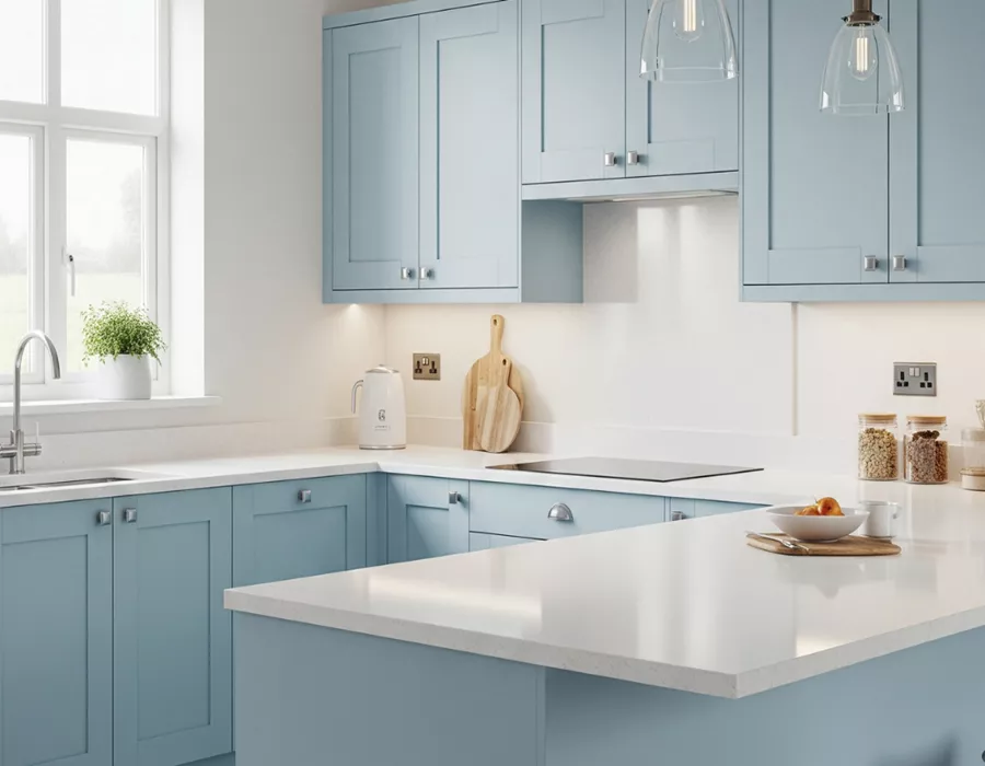
Sage, olive, navy and deep green can add personality without making a kitchen feel dated when balanced with the right countertop. Light quartz or porcelain can brighten darker cabinetry, while granite with controlled movement can create a richer, more natural look. For a bold cabinet colour, keeping the countertop pattern quieter usually creates a more balanced result.
White Kitchens: Add Contrast Instead of More White
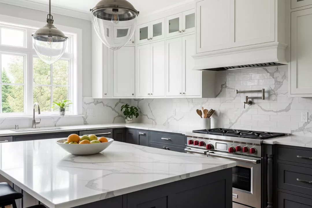
White cabinets remain versatile, but an all-white kitchen can feel flat if every surface has the same tone. Consider soft grey veining, warm Calacatta-style movement, subtle texture or a darker island surface to introduce depth. A carefully chosen countertop becomes the visual bridge between cabinetry, flooring, backsplash and hardware without overwhelming the room.
Two-Tone Kitchens: Let the Countertop Connect the Palette
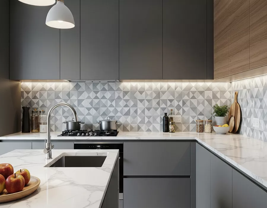
Two-tone kitchens work best when the countertop visually connects both cabinet colours. A white island with darker perimeter cabinets, for example, can be unified by a quartz or porcelain surface containing both light and grey tones. If you are comparing combinations, our guide to kitchen colour palettes can help you think through the overall room before selecting a slab.
Dark Kitchens: Balance Mood with Light and Surface Movement
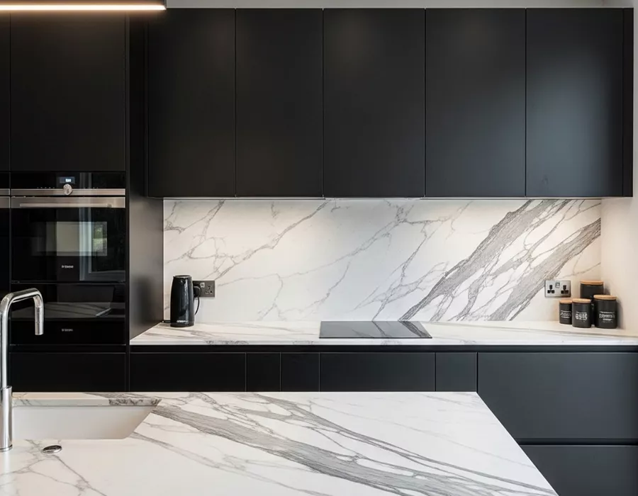
Charcoal, black and espresso cabinetry can look sophisticated, especially in kitchens with good natural light. To keep the room from feeling heavy, pair dark cabinets with lighter countertops, visible veining or reflective finishes. In larger spaces, a darker granite or dramatic porcelain can also work well when the flooring, backsplash and lighting provide enough contrast.
Choose the Combination in Person
Screens can change how colours appear, so the best decision is made by comparing cabinet samples, flooring and actual slab material together. If you are planning new kitchen countertops in Vernon, Kelowna or the North Okanagan, Countertops Specialist can help you compare quartz, granite and porcelain options that fit your cabinetry and overall design.